
Sean Kennedy
March 19, 2023
Introduction
Ah, responsive web design. The unsung hero of the digital age, ensuring websites cater to users' needs across devices and screen sizes far and wide. In this blog post, we will delve deeper into the core aspects of responsive design, including fluid grids, flexible images, CSS Flexbox, and media queries. We'll also shine a light on the no-code community and its savvy developers and platforms, uncovering how they harmoniously embrace these responsive design principles.
The Birth of Responsive Web Design
Before diving into the technical aspects of responsiveness, it is essential to understand its origins. The term "responsive web design" was coined by Ethan Marcotte in 2010. As mobile devices gained popularity, web designers faced the challenge of designing websites that looked and functioned well on various devices and screen sizes. The concept of responsive design was introduced to address this challenge, enabling designers to create websites that adapted gracefully to different devices and screen resolutions.
CSS and the Evolution of Responsive Design
Since its inception in the late 1990s, Cascading Style Sheets (CSS) has been the cornerstone of responsive design. It allows designers to control the layout, appearance, and overall look of a website. By using CSS, web designers can create flexible, fluid layouts that automatically adjust to different screen sizes and orientations. This flexibility is achieved through the use of relative units (such as percentages) instead of absolute units (like pixels) for defining widths, heights, and other properties.
No-code platforms like toddle have integrated these responsive design principles to empower non-technical developers to create adaptable websites without writing any code. With the introduction of CSS3, new features and capabilities further facilitated the implementation of responsive design, such as media queries and advanced layout modules like Flexbox and Grid. No-code platforms leverage these advancements to provide built-in responsiveness, visual design tools, and customisable options, making responsive design accessible to a broader audience.
Media Queries: Fine-Tuning the Responsive Experience
Media queries, first introduced in CSS3, serve as the linchpin of responsive design, allowing web designers to apply different CSS rules based on specific user device conditions. No-code platforms often incorporate media queries to provide breakpoint functionality and tailor the website's layout and appearance for various screen sizes, resolutions, and orientations. This fine-tuning ensures that users enjoy a seamless browsing experience, regardless of their device.
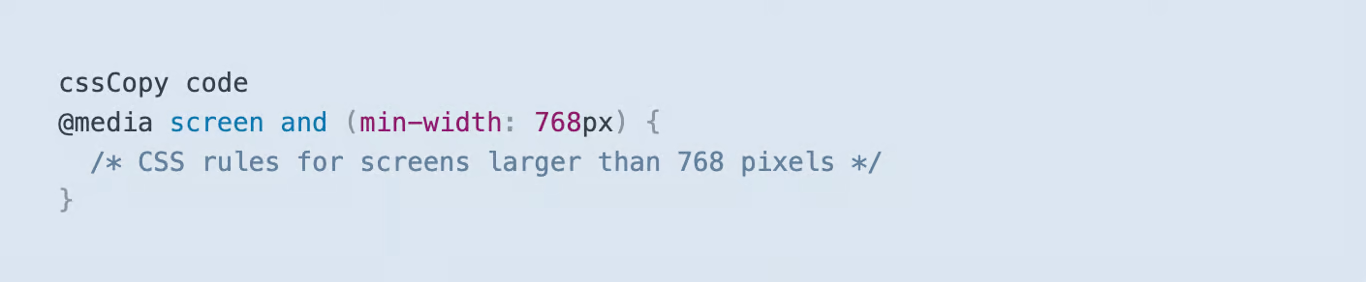
Media queries utilise the @media rule, followed by a media type (e.g., "screen" or "print") and one or more expressions that test device properties. For instance:
The media query above will apply the enclosed CSS rules only if the device's screen width is at least 768 pixels, enabling the designer to fine-tune the layout and appearance for a range of screen sizes.
When using a no-code platform such as toddle, no-code developers can use visual interfaces to define breakpoints and adjust layout settings, while the platform generates the necessary media queries in the background. This approach abstracts the complexity of the code, making it easier for non-technical users to create responsive designs.
Fluid Grids: Adaptable Layouts for Every Screen Size
A fluid grid system lies at the heart of responsive design, ensuring that the layout adapts smoothly to different screen sizes. By using relative units (such as percentages) instead of absolute units (like pixels), designers can create layouts that automatically adjust to the available screen real estate.
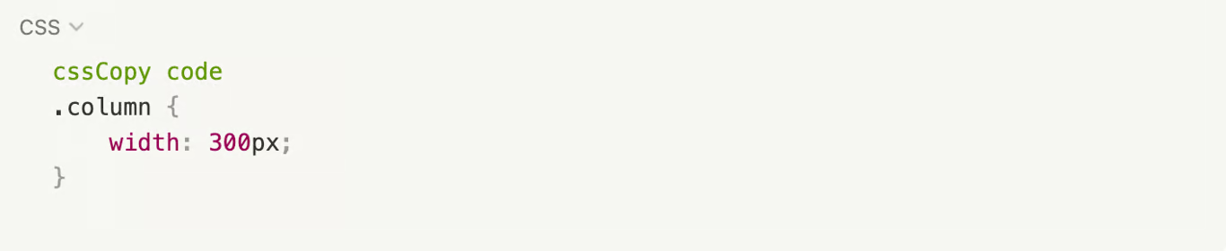
For example, consider a three-column layout with fixed-width columns:
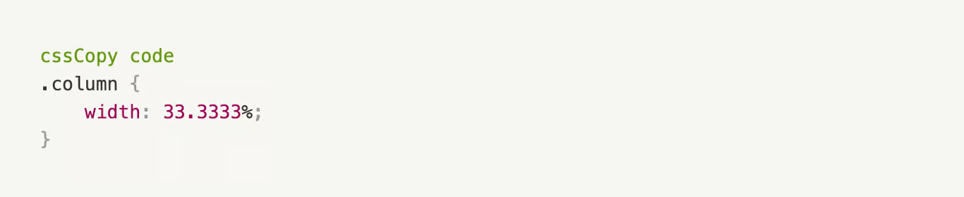
This layout would appear distorted or misaligned on smaller screens. By using percentages instead, the columns can adapt to the screen size:
In this case, each column takes up a third of the available space, regardless of the screen size, ensuring a consistent appearance across different devices.
Again, when using a No-code platform. Drag-and-drop functionality and visual tools allow users to create fluid grid layouts without writing code. Users can adjust settings and resize elements while the platform generates the appropriate CSS to ensure a responsive design.
Flexible Images: Maintaining Visual Integrity
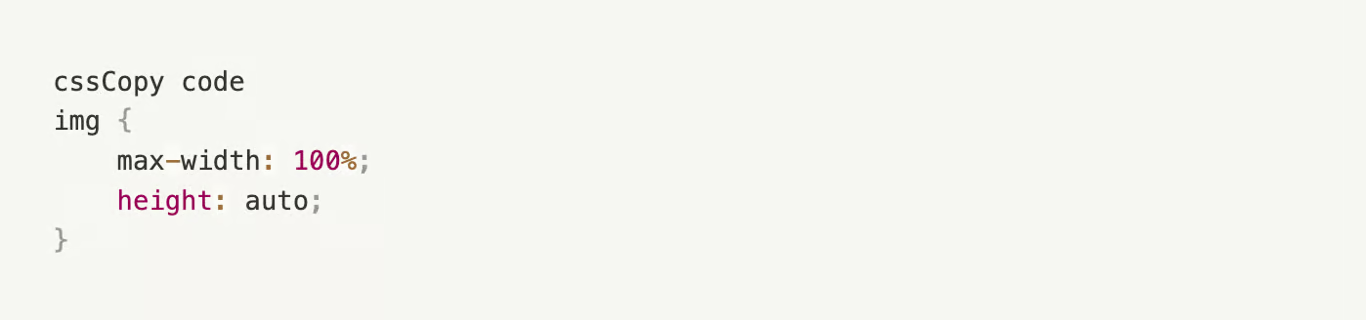
Ensuring images scale and resize appropriately is crucial to maintaining a website's visual integrity. One common technique is to set the image's width to 100% and height to auto, which allows the images to maintain their aspect ratio and ensures they do not exceed their container's dimensions.
This approach prevents images from becoming distorted or pixelated as they adapt to different screen sizes. No-code platforms often include built-in functionality for handling responsive images, allowing users to maintain aspect ratios and ensure images do not exceed their container's dimensions. Using visual design tools, no-code developers can easily adjust image settings and implement best practices for responsive images without diving into the complexities of CSS, as shown above.
CSS Flexbox: A Modern Approach to Responsive Layouts
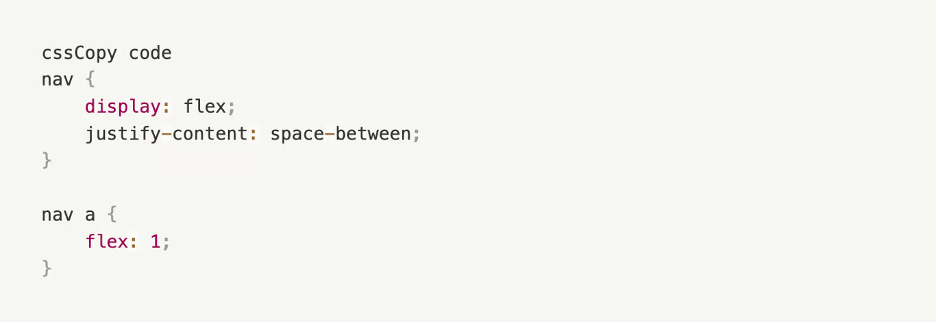
CSS Flexbox is a powerful layout module that simplifies creating flexible, responsive designs. It enables designers to create complex layouts easily and ensures that elements within a container automatically adjust their size and position based on available space. Here is a simple example of using Flexbox to create a responsive navigation menu:
In this example, the navigation menu items automatically adjust their width to fill the available space, ensuring an evenly spaced, visually appealing layout across different screen sizes. Again, the joy of a No-code platform like toddle is that they incorporate Flexbox functionality into their visual design tools, making it easy for non-technical developers to build responsive layouts without writing any code. Users can drag and drop elements or adjust settings to leverage the power of Flexbox while the platform generates the necessary CSS in the background. A simple example of using Flexbox in a no-code platform could be creating a responsive navigation menu. By adjusting settings or using pre-built Flexbox components, no-code developers can create a navigation menu with items that automatically adjust their width to fill the available space, ensuring an evenly spaced, visually appealing layout across different screen sizes.
Responsivity is crucial
Responsive web design has revolutionized how websites are built and experienced by users, and its integration into no-code development platforms has made it accessible to a much broader audience. By leveraging the capabilities of CSS, media queries, fluid grids, flexible images, and CSS Flexbox, no-code developers can craft websites that provide a seamless, enjoyable experience across various devices and screen sizes. As technology advances and new devices emerge, the importance of responsive design will only grow, making it an indispensable skill for both traditional web designers and no-code developers. By mastering these core concepts and techniques and taking advantage of the built-in functionality of no-code platforms, you can ensure that your websites remain accessible, visually appealing, and user-friendly. So let's toast the ever-evolving digital landscape, where responsive design reigns supreme, and websites dance gracefully across screens big and small. Cheers to a future with accessible, visually stunning, and oh-so-user-friendly digital creations! Made in a toddle, of course!

.jpeg/public)